Chaobin Tang (唐超斌)
Logistic Regression on Income Prediction
Previously, the linear regression model is defined as the linear sum of the parameters and input:
Using the Mean Squared Error as the cost, the training data is used to fit the model so that its predictions differ from the data as little as possible.
In classification problems, our goal is to assign the data point to a class C for a given x. Given two classes, using the same model above, we can interpret the result as the the decision boundary between two classes. The decision boundary can be geometrically viewed as the hyperplane in a d(dimension of x) dimentional space. In the simplest case when d = 2, the decision boundary is a straight line that separates the input space into two classes, x belongs to C1 when y(x) > 0, and C2 when y(x) < 0. The SVM is closely related to this choice of decision boundary and a different choice of the cost function relates it also closely to other discriminant functions to be discussed here.
The generalized discriminant function takes the form:
In [1]:
%pylab inline
import math
import numpy as np

from isaac.plots import basic as basic_plots
Populating the interactive namespace from numpy and matplotlib
Sigmoid function
The word sigmoid means S-shaped. The sigmoid function is defined as:
In [4]:
def sigmoid(arr):
    return 1 / (1 + np.exp(- arr))
In [5]:
X = np.arange(-10, 10, 0.01)
Y = sigmoid(X)
basic_plots.plot(X, Y, label="sigmoid", title="The sigmoid function",
                loc="upper left", show=False)
basic_plots.plot(0, 0.5, style='bo')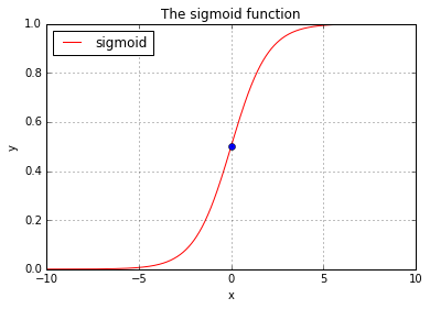
Model representation and interpretation
Use sigmoid function as the descriminant function, we can define the model as:
The sigmoid function allows the result of the model to be interpreted as the posterior probability (p(C|x)). When we have two classes, we can draw:
Thus
Thus
That means if we have our hypothesis equals to 0.4, the interpretation says there is a 40% chance that y = 1, or there is (1 - 40%) = 60% chance that y = 0.
Cost - Given the labelled data, what are the most likely parameters?
Having defined the discriminant function that will output the probability P(C|x), we are now motivated to find a cost function that can be used to quantize the quality of the prediction. In the linear regression model, we used the MSE to do that. Bear in mind that in classification problem, the data is labelled. For a two class problem, x in the training set is either labelled 1 denoting one class, or 0 denoting the other. Since the model outputs a probability P(C|x), it is natural to think of a likelihood function:
says that the likelihood of a set of parameter values, θ, given outcomes x, is equal to the probability of those observed outcomes given those parameter values. To use the training data X = {x_0, …, x_n} to help define the parameters, the definition of the likelihood function therefore is:
Or to say, the likelihood of the parameters is the joint probability of each x given parameters.
The factorial term in the likelihood function presents some computation problem, such as underflow. And also working with other computations can be much more convenient, a very special choice of mathematical trick is then performed on the likelihood function by applying the natural log on it. And it becomes:
Because all log functions maps multiplication into addition where:
The log-likelihood function becomes:
which is computationally a lot easier to work with (such as because it avoids the underflow problem). For our purpose, we also take the negation of the log- likelihood (because we want to maximize the probability of parameters), and we use it as the cost function of our discriminant function:
Combining the two together we get:
If the cost is then defined over a training data set, we take the mean of the summed error:
The following code plots the sigmoid function side by side with the error measure:
In [5]:
Y_1 = Y[Y >= 0.5] # the right half
cost_Y_1 = (- np.log(Y_1))
Y_2 = Y[Y <= 0.5] # the left half
cost_Y_2 = (- (1 - np.log(Y_2)))

basic_plots.plot(X, Y, label="sigmoid", title="The sigmoid function",
                loc="upper left")
plots = (
    (basic_plots.plot, (X[X >= 0], Y_1), {'title': 'h(Theta) >= 0.5, Y = 1'}),
    (basic_plots.plot, (Y_1, cost_Y_1), {
            'title': '- log(h(Theta))',
            'label_xy': ('h(Theta)', 'cost(h(Theta))')}),
    (basic_plots.plot, (X[X <= 0], Y_2), {'title': 'h(Theta) <= 0.5, Y = 0'}),
    (basic_plots.plot, (Y_2, cost_Y_2), {
            'title': '- log(1 - h(Theta))',
            'label_xy': ('h(Theta)', 'cost(h(Theta))')})
)
basic_plots.subplots(2, 2, sharex=False, sharey=False, order='v', plots=plots)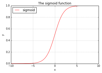
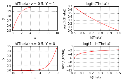
Intuitively as the graph above shows, the error measure decreases as h(Theta) approaches to the value indicating the correct output.
The choice of these error measure also has desired mathematical property, whereas -log() is continuous or differentiable and it is a convex function, meaning it has a global minimum.
Income Prediction
An archive of the survey on income was used here. In this post, a logistic model is built, using a subset of features selected by visual guide. The model was then trained using the entire set of the training data contains 32561 entries. The model reports a 16273/16281 accuracy on the test data that contains 16281 entries.
In [7]:
import requests

# http://archive.ics.uci.edu/ml/datasets/Adult
DATA_INCOME = {
    'sample': 'http://archive.ics.uci.edu/ml/machine-learning-databases/adult/adult.data',
    'manual': 'http://archive.ics.uci.edu/ml/machine-learning-databases/adult/adult.names',
    'test': 'http://archive.ics.uci.edu/ml/machine-learning-databases/adult/adult.test'
}
DATA_INCOME = {
    k: requests.get(link).text
    for (k, link) in DATA_INCOME.items()
}
In [8]:
from collections import OrderedDict

DATA_TYPES = OrderedDict([
    ('age', np.int8),
    ('wrkcls', np.str), # work class
    ('fnlwgt', np.int32), # final weight
    ('educt', np.str), # education
    ('eductnum', np.int8), # education num
    ('marital', np.str), # marital status
    ('occup', np.str), # occupation
    ('rltsh', np.str), # relationship
    ('race', np.str),
    ('sex', np.str),
    ('capgain', np.int32), # capital gain
    ('caploss', np.int32), # capital loss
    ('hrperw', np.int8), # hour per week
    ('ntvctry', np.str), # native country
    ('fiftyK', np.int8) # >50k
])
In [9]:
# size of our data
for (k, v) in DATA_INCOME.items():
    print(k, len(v))
manual 5229
sample 3974305
test 2003153
In [10]:
from collections import OrderedDict

def get_headers():
    headers = list(DATA_TYPES.keys())
    def strip_and_replace(v):
        _v = v.strip(' .').lower()
        _v = _v.replace('-', '_')
        if _v == '?': return pd.NaT
        return _v

    converters = {}
    for h in headers:
        if DATA_TYPES[h] == np.str:
            converters[h] = strip_and_replace
    converters['fiftyK'] = lambda v: 1 if v == ' >50K' else 0
    return headers, converters

HEADERS, CONVERTERS = get_headers()
In [11]:
import os
import tempfile
from io import StringIO

import pandas as pd

PATH_PICKLE = os.path.join(tempfile.gettempdir(), "pickles")
if not os.path.exists(PATH_PICKLE): os.mkdir(PATH_PICKLE)
PATH_DF_INCOME_TRAINING = os.path.join(PATH_PICKLE, 'income_training.pickle')
PATH_DF_INCOME_TEST = os.path.join(PATH_PICKLE, 'income_test.pickle')


def get_training_data():
    if os.path.exists(PATH_DF_INCOME_TRAINING):
        return pd.read_pickle(PATH_DF_INCOME_TRAINING)
    df = pd.read_csv(
        StringIO(DATA_INCOME['sample']), # no copy created
        header=None,
        names=HEADERS,
        na_values=['?'],
        converters=CONVERTERS,
        comment='|',
        dtype=DATA_TYPES)
    # cache it
    pd.to_pickle(df, PATH_DF_INCOME_TRAINING)
    return df

def get_test_data():
    if os.path.exists(PATH_DF_INCOME_TEST):
        return pd.read_pickle(PATH_DF_INCOME_TEST)
    df = pd.read_csv(
        StringIO(DATA_INCOME['test']),
        header=None,
        names=HEADERS,
        na_values=['?'],
        converters=CONVERTERS,
        comment='|',
        dtype=DATA_TYPES)
    # cache it
    pd.to_pickle(df, PATH_DF_INCOME_TEST)
    return df

DF_INCOME_TRAINING = get_training_data()
DF_INCOME_TEST = get_test_data()
In [12]:
DF_INCOME_TEST.shape(16281, 15)
In [13]:
DF_INCOME_TRAINING.shape(32561, 15)
Categorical Value
Or, discrete independent predictor in other context, are values that can only take on integer values, while continuous values can take any value. In the data set we have here, columns such as sex, occupation, relationship, and race, they are all categorical values. In logistic regression, when scaling the features, we expect to normalize the features into a range [-1, 1] or [0, 1], with categorical values, this will not make sense. So the preprocess need to handle these categorical values (There exists other algorithms that can handle categorical value natively, such as Random Forest).
A question on handling categorical value in LR
In [14]:
# pandas.get_dummies:
#     Convert categorical variable into dummy/indicator variables
DF_INCOME_TRAINING = pd.get_dummies(DF_INCOME_TRAINING)
In [15]:
import os
import tempfile
PATH_PICKLE = os.path.join(tempfile.gettempdir(), "pickles")
if not os.path.exists(PATH_PICKLE): os.mkdir(PATH_PICKLE)
PATH_DF_INCOME_TRAINING = os.path.join(PATH_PICKLE, 'income_training.pickle')
PATH_DF_INCOME_TEST = os.path.join(PATH_PICKLE, 'income_test.pickle')
In [16]:
# less than 50K
DF_INCOME_TRAINING_GT_50K = DF_INCOME_TRAINING[DF_INCOME_TRAINING.fiftyK == 1]
# larger than 50K
DF_INCOME_TRAINING_LT_50K = DF_INCOME_TRAINING[DF_INCOME_TRAINING.fiftyK == 0]
Observe data
Let’s start by observing data, this is where we can apply some common sense, I think.
In [17]:
%matplotlib inline
import matplotlib.pyplot as plt

def plot_scores_in_comparison(df1, df2, f1, f2, l1=None, l2=None,
                              xlabel=None, ylabel=None,
                              legend=True, legend_loc=None):
    plt.plot(df1[f1], df1[f2], 'o', color='orange', label=l1)
    plt.plot(df2[f1], df2[f2], 'ko', fillstyle='none', label=l2)
    xlabel = xlabel if xlabel else f1
    ylabel = ylabel if ylabel else f2
    plt.xlabel(xlabel, weight='bold')
    plt.ylabel(ylabel, weight='bold')
    plt.grid(True)
    if legend:
        plt.legend(loc=legend_loc) if legend_loc else plt.legend()
    plt.show()
In [18]:
with basic_plots.zoom_plot(8, 5):
    plot_scores_in_comparison(
        DF_INCOME_TRAINING_GT_50K,
        DF_INCOME_TRAINING_LT_50K,
        'hrperw', 'eductnum',
        '>50K', '<=50K',
        'hour per week', 'years of education',
        legend_loc='lower right')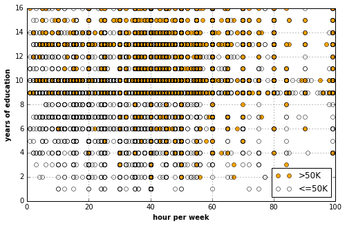
In [19]:
# The following really gives us some
# insight about the 50K group.
with basic_plots.zoom_plot(8, 5):
    plot_scores_in_comparison(
        DF_INCOME_TRAINING_GT_50K,
        DF_INCOME_TRAINING_LT_50K,
        'age', 'hrperw',
        '>50K', '<=50K',
        'age', 'hour per week')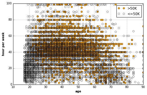
In [20]:
from operator import itemgetter

def plot_categories(df, categories, fiftyK=True):
    '''
    Plot the num of people earns 50K+
    in their group. The group can be defined by occupation,
    country, education, race, and sex perhaps.

    categories
        list, list of category names.
    '''

    stats = {} # O(1)
    for ctgr in categories:
        total = len(df[df[ctgr] == 1])
        key = (ctgr, total)
        stats[key] = {}
        fiftyK = len(df[(df[ctgr] == 1) & (df.fiftyK == 1)])
        nfiftyK = len(df[(df[ctgr] == 1) & (df.fiftyK == 0)])
        num_fftK = stats[key].setdefault('fftk', fiftyK)
        num_nfftK = stats[key].setdefault('nfftk', nfiftyK)
    fig, ax = plt.subplots()

    # O(nlogn) where n == len(categories)
    keys_ordered = sorted(stats.keys(), key=itemgetter(1),
                          reverse=True)
    # O(n) where n == len(categories)
    num_fftK = [stats[k]['fftk'] for k in keys_ordered]
    num_nfftK = [stats[k]['nfftk'] for k in keys_ordered]

    plt.bar(
        range(len(categories)), num_fftK,
        width=0.5, color='orange', alpha=0.75, align='edge',
        label='>50K')
    plt.bar(
        range(len(categories)), num_nfftK,
        bottom=num_fftK,
        width=0.5, color='white', alpha=0.75, align='edge',
        label='<=50K')

    xtick_labels = [c[(c.find('_')+1):] for (c, t) in keys_ordered]
    ax.set_xticks(range(len(categories)))
    rotation = 45 if len(categories) < 20 else "vertical"
    ax.set_xticklabels(xtick_labels, rotation=rotation, fontstyle="italic")

    plt.legend(loc='upper right')
    plt.grid(True)
    plt.title("ratio of 50K people in %s groups" % len(categories))
    plt.show()
In [21]:
COLUMNS = DF_INCOME_TRAINING_GT_50K.columns.tolist()
with basic_plots.zoom_plot(8, 5):
    plot_categories(
        DF_INCOME_TRAINING,
        list(filter(lambda c: c.startswith('occup'), COLUMNS)))
In [22]:
with basic_plots.zoom_plot(8, 5):
    plot_categories(
        DF_INCOME_TRAINING,
        list(filter(lambda c: c.startswith('wrkcls'), COLUMNS)))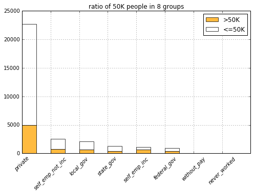
In [23]:
with basic_plots.zoom_plot(8, 5):
    plot_categories(
        DF_INCOME_TRAINING,
        list(filter(lambda c: c.startswith('educt'), COLUMNS)))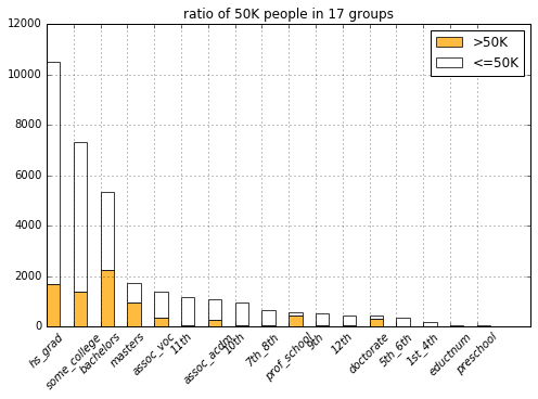
It looks like people with less promising education experiences (from having no bachelor degree to lesser, e.g., hs_grad) fall into the 50K group much less often. It’s also obvious to see that most professors and PhDs make more than 50K (Though it also shows that higher eduction don’t correspond to the 50K pay that strictly, I guess this might be because they are students that are not working).
In [24]:
with basic_plots.zoom_plot(8, 5):
    plot_categories(
        DF_INCOME_TRAINING,
        list(filter(lambda c: c.startswith('ntvctry'), COLUMNS)))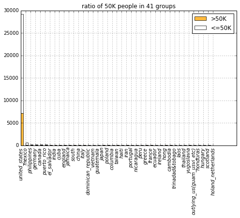
It looks country doesn’t serve as a informative predictor because it takes up too absolutely too many samples.
In [25]:
with basic_plots.zoom_plot(4, 4):
    plot_categories(
        DF_INCOME_TRAINING,
        list(filter(lambda c: c.startswith('sex'), COLUMNS)))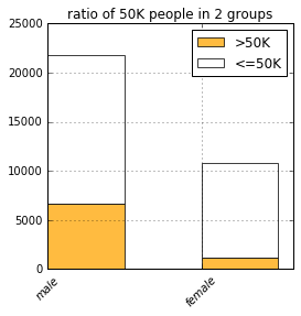
In [26]:
with basic_plots.zoom_plot(6, 4):
    plot_categories(
        DF_INCOME_TRAINING,
        list(filter(lambda c: c.startswith('race'), COLUMNS)))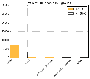
In [27]:
with basic_plots.zoom_plot(6, 4):
    plot_categories(
        DF_INCOME_TRAINING,
        list(filter(lambda c: c.startswith('rltsh'), COLUMNS)))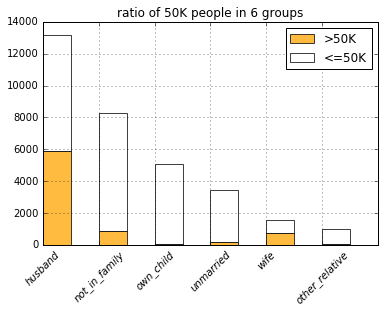
In [28]:
with basic_plots.zoom_plot(6, 4):
    plot_categories(
        DF_INCOME_TRAINING,
        list(filter(lambda c: c.startswith('marital'), COLUMNS)))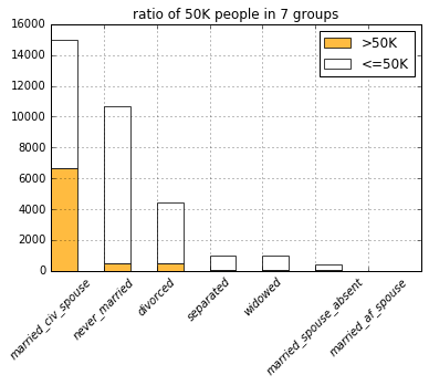
Somehow, people in the never married group doesn’t fall into the 50K group that much.
Summing all the observations, I am going to experiment with an LR model with these predictors:
- age, age
- hours of work per week, hrperw
- years of education, eductnum
- whether is married, marital_never_married
- whether only made it to high school, educt_hs_grad
- whether only made it to some college, educt_some_college
- whether works in a service industry, occup_other_service
Construct out model and preprocess the data
In [30]:
from isaac.models import regressions
reload(regressions)
LR = regressions.LogisticRegression
In [31]:
features = ['hrperw', 'eductnum', 'marital_never_married',
           'educt_hs_grad', 'educt_some_college', 'occup_other_service']
column_names = list(DF_INCOME_TRAINING.columns)
columns = [column_names.index(f) for f in features]
In [32]:
from isaac.pipeline import preprocess
# get the numpy array to work with
data = DF_INCOME_TRAINING.values
X, Y = preprocess.get_XY_from_frame(data, columns, column_names.index('fiftyK'))
In [33]:
model = LR.from_dimension(len(features) + 1)In [34]:
# initial cost
print('cost:', model.costs(X, Y))
print('accuracy:', model.accuracy(X, Y))
cost: 1.21071031349
accuracy: 0.298117379687
Start training
In [35]:
from isaac.optimizers import gradientIn [36]:
descent = gradient.Descent(model, X, Y, 0.2)In [37]:
descent.run(100)
print(model.costs(X, Y))
0.571466504217
In [38]:
model.accuracy(X, Y)0.75003838948435242
Cross validation
In [39]:
# Preprocess the test data
DF_INCOME_TEST = pd.get_dummies(DF_INCOME_TEST)
data_test = DF_INCOME_TEST.values
_X, _Y = preprocess.get_XY_from_frame(data_test, columns, column_names.index('fiftyK'))
In [40]:
print("cost:", model.costs(_X, _Y))
print("accuracy:", model.accuracy(_X, _Y))
cost: 0.350563860528
accuracy: 0.990172593821
In [None]: